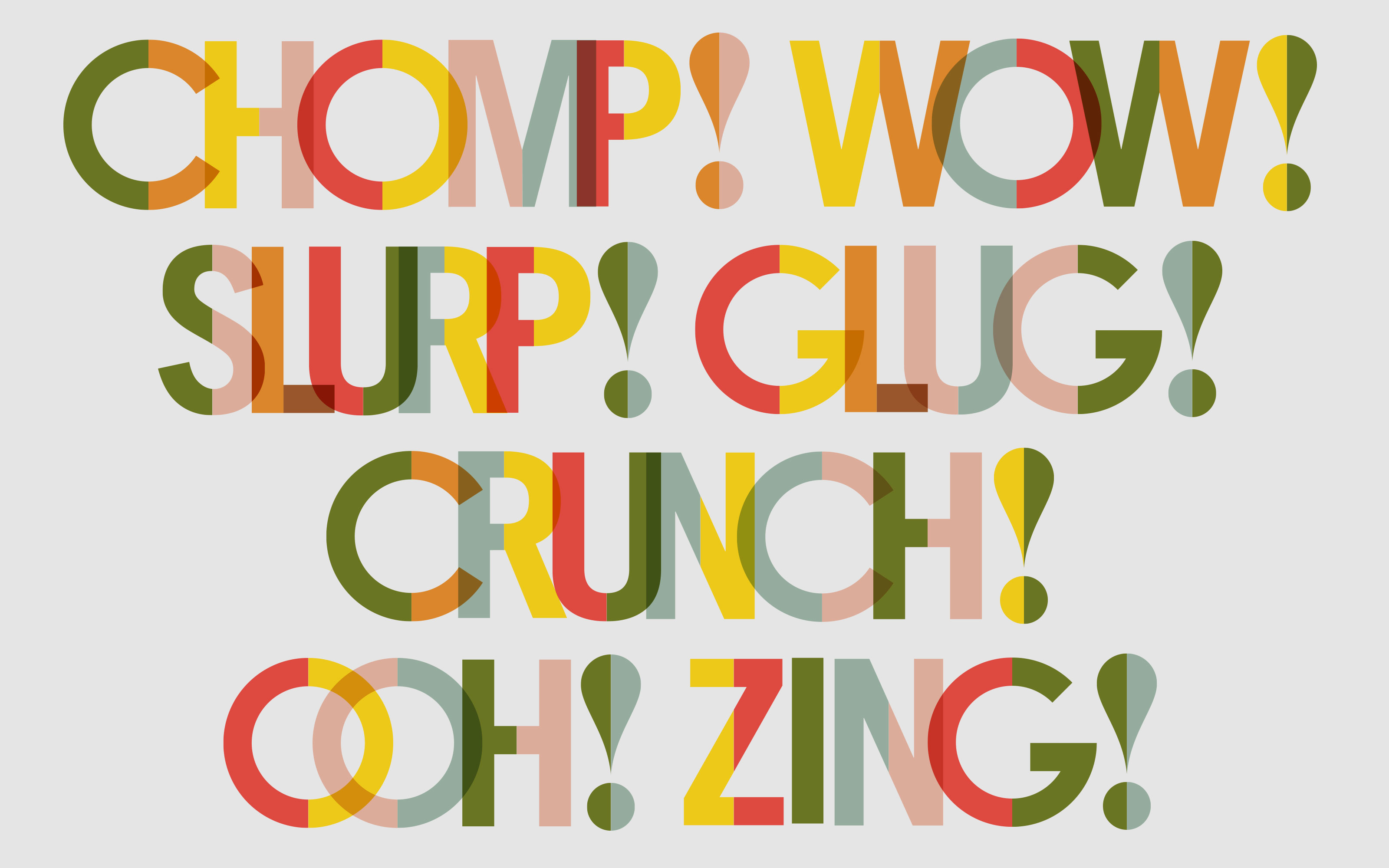
Created in part as a response to a personalising each store location, I devised and produced a bespoke, hand-rendered font in two widths.
Fast and friendly tone of voice
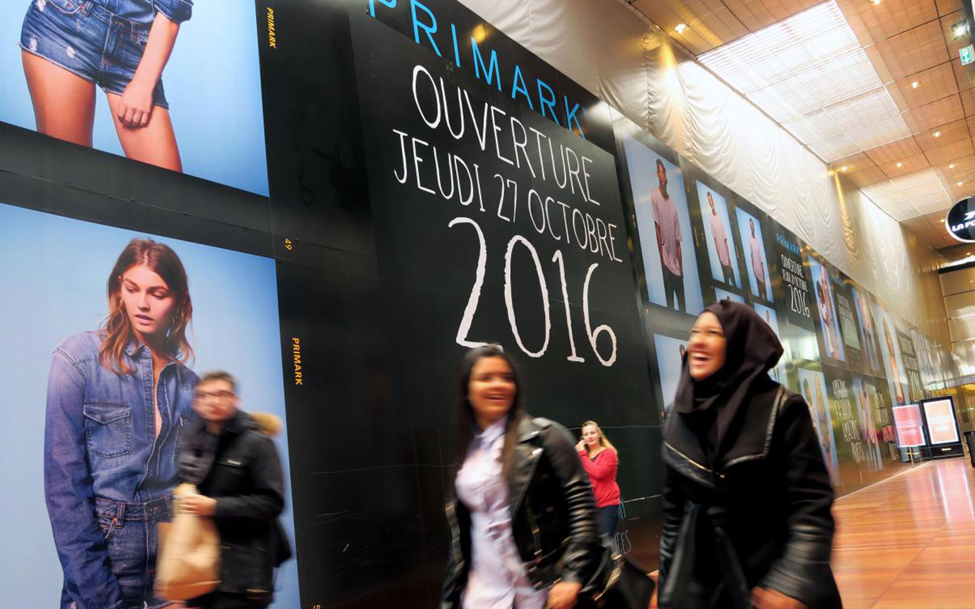
With over 350 stores internationally, Primark serves a global audience of shoppers looking for the fast fashion at a low price.
 Photography: Patrick Delecroix – VDNPQR
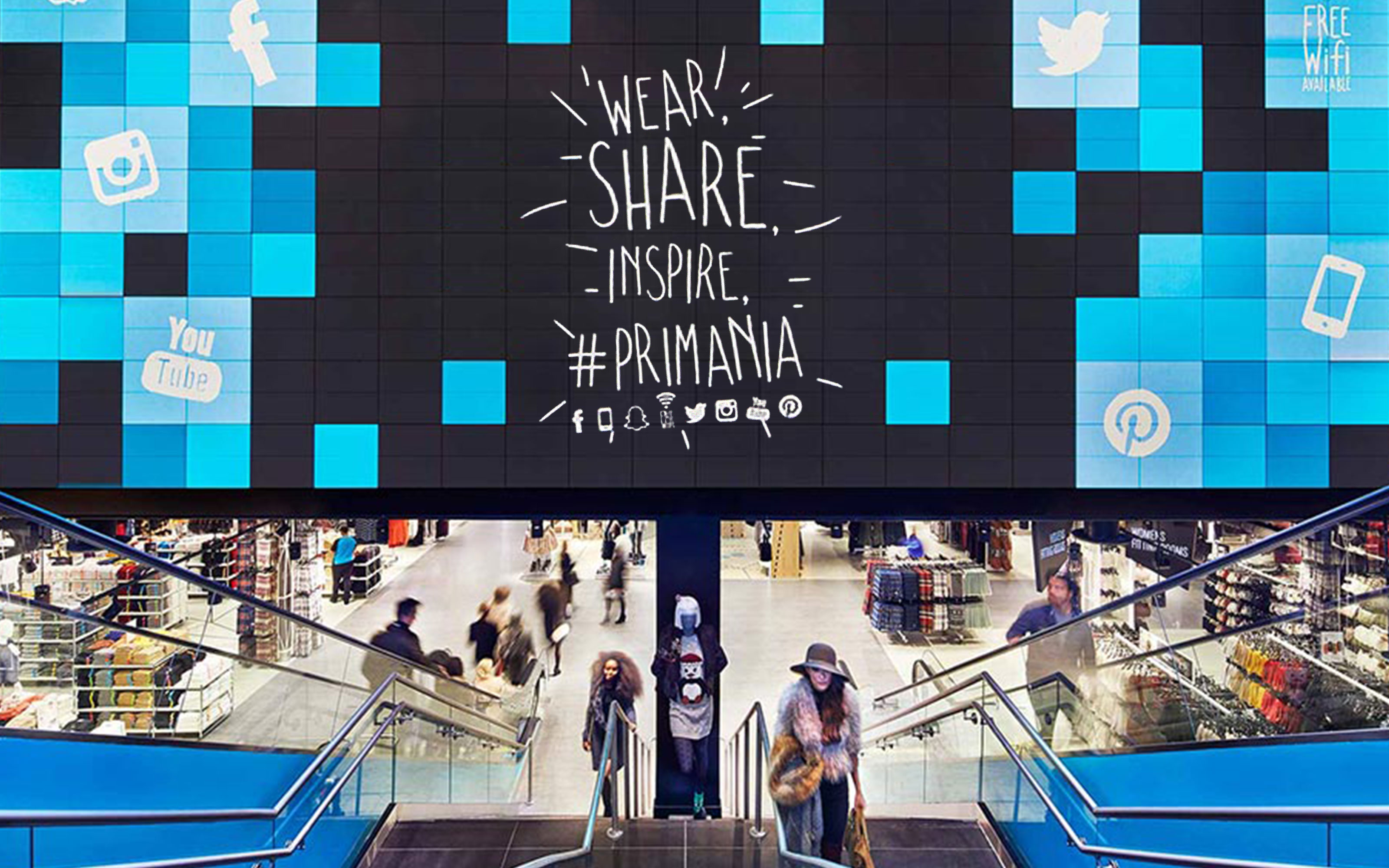 Photography: John Muggenborg
Out with a friend
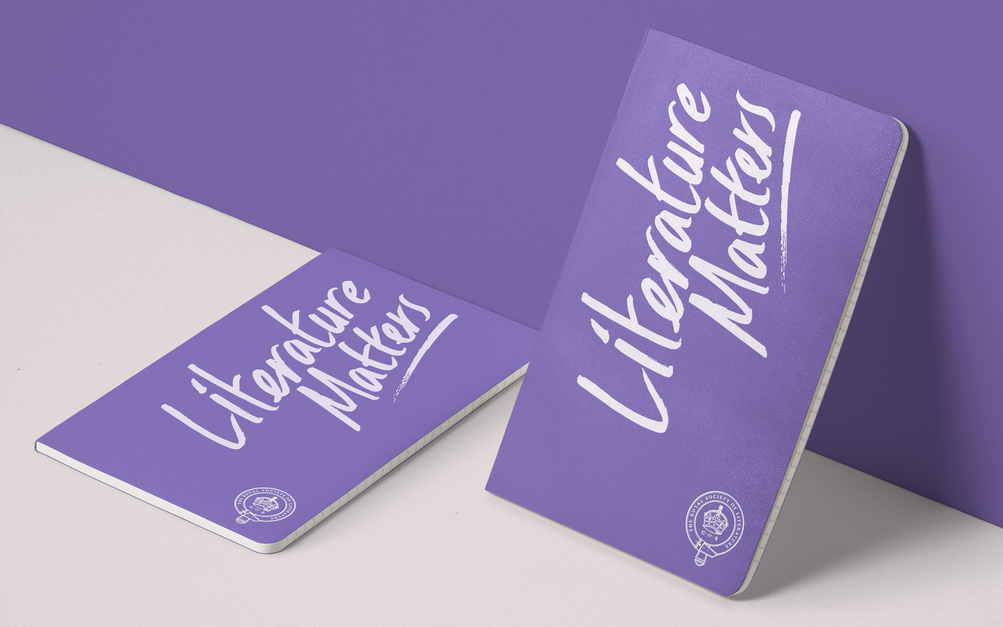
The handwriting allowed messaging to break out of the brand sans serif and welcome the customer into their Primark. It’s the voice of a friend telling you that you look great in that top. And just £6? It’s a bargain!The typeface covers almost every touchpoint, from hoardings to ticketing, and digital screens to social media assets.
From pencil to print
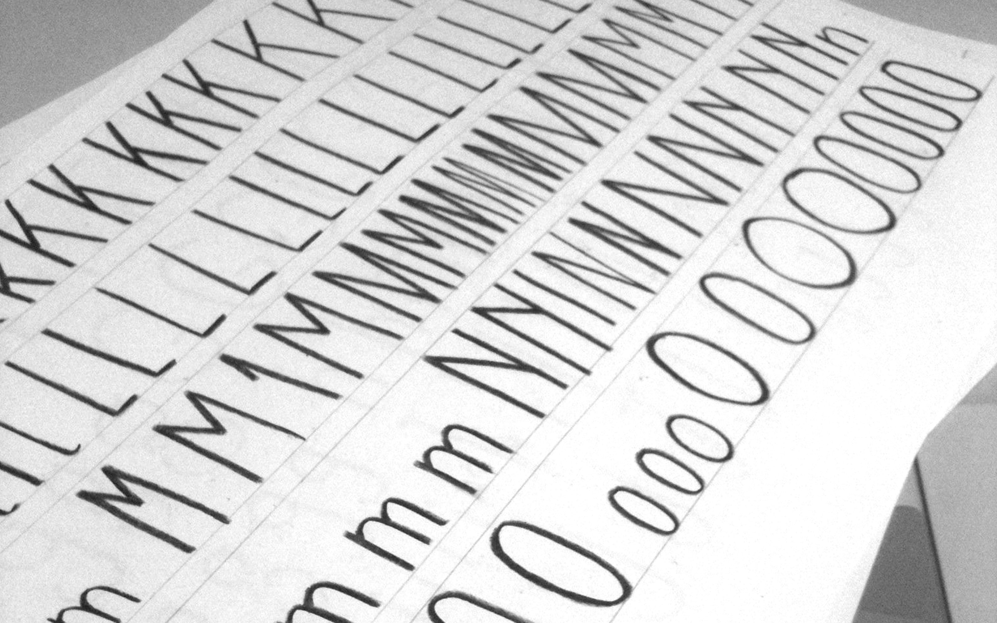
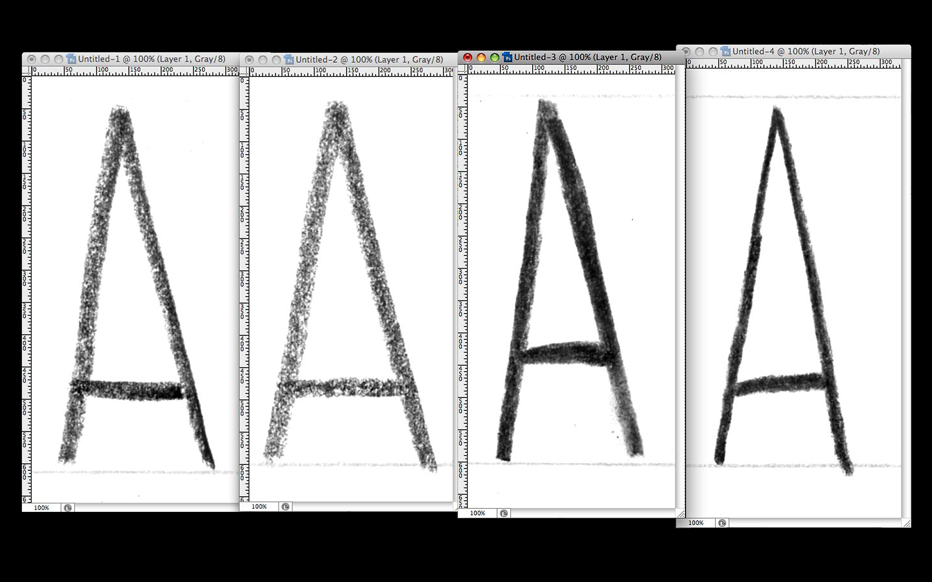
I experimented with four different pencils, writing out each letter of the alphabet multiple times over. Then I scanned the sheets in, isolated and cleaned up my preference of each character and converted them to vector outlines.I then used these to create the font, set the kerning pairs and export as a shareable, working Open Type file with a full set of numerals, punctuation and accented characters.
This project was completed at Dalziel and Pow Ltd..© Dalziel and Pow Ltd.
 Experiments with different writing materials