To communicate these principles from Pentagram’s rebrand in store, we identified key moments in the customer journey and used these to highlight and celebrate the services offered at each branch.
Landing the rebrand in store
The John Lewis & Partners rebrand centred on placing the role of Partners, and the employee-owned structure of the Partnership, at the forefront of customers’ minds.
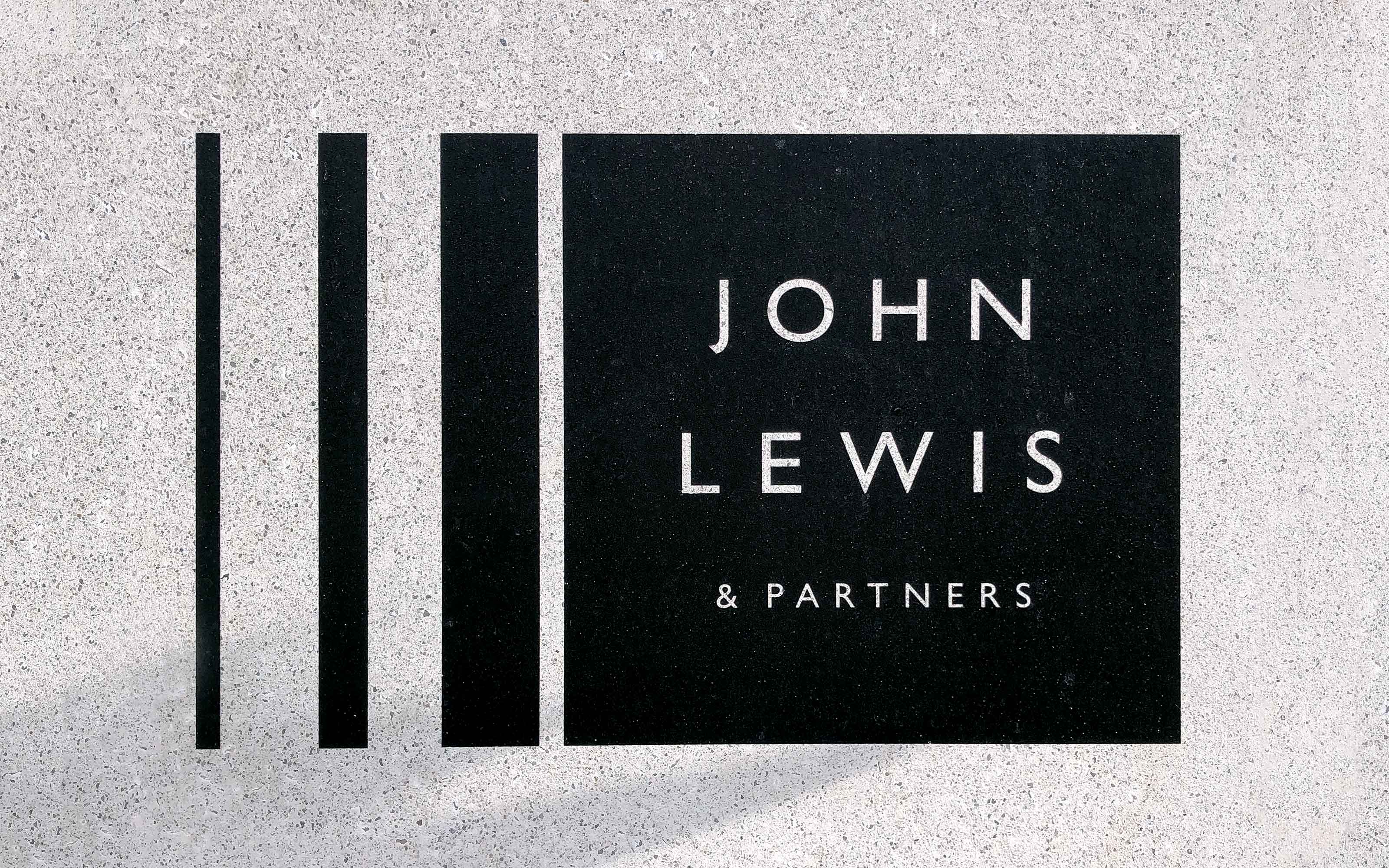
 John Lewis & Partners, Oxford Street
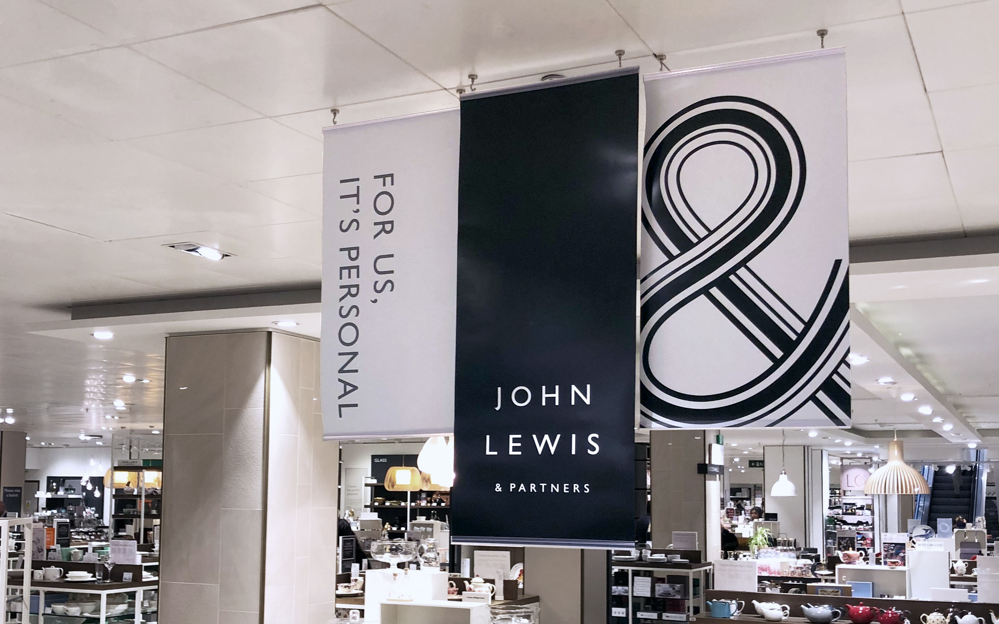 Hanging banners used throughout stores for the rebrand launch
A bolder approach
A more playful and expressive attitude was taken with typography, experimenting with scale and layout.Maintaining the well-established John Lewis & Partners cut of Gill Sans unified messaging, but different executions created a change of pace across the store.
 Home Design Service, Oxford Street
 The Style Studio, Oxford Street
Meet Your...
The introduction of illuminated signage elevated the service spaces, giving them increased presence in store and boosting customer understanding of services.These were supported by an introductory message, inviting you to ‘Meet Your…’ Personal Stylists, Nursery Advisors, etc., both highlighting Partner expertise, while introducing a more approachable tone of voice.
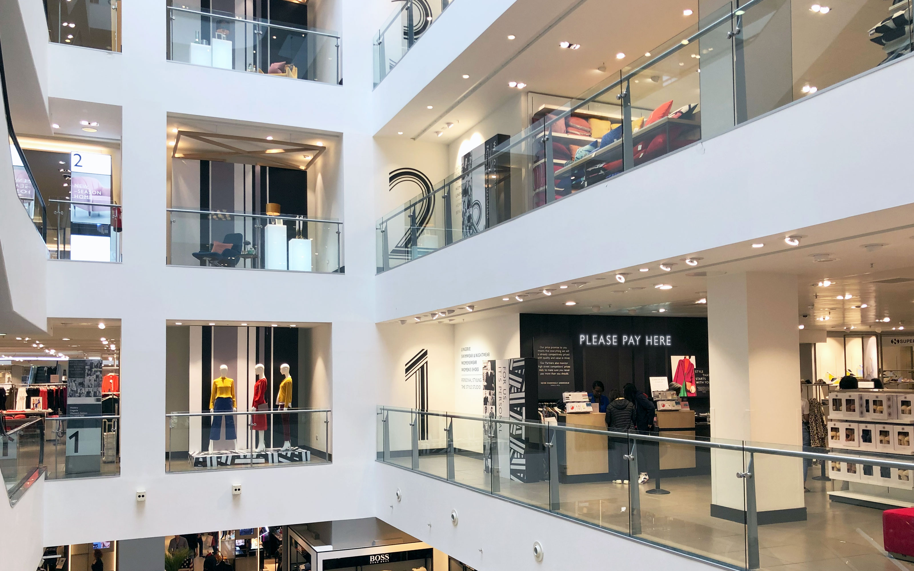
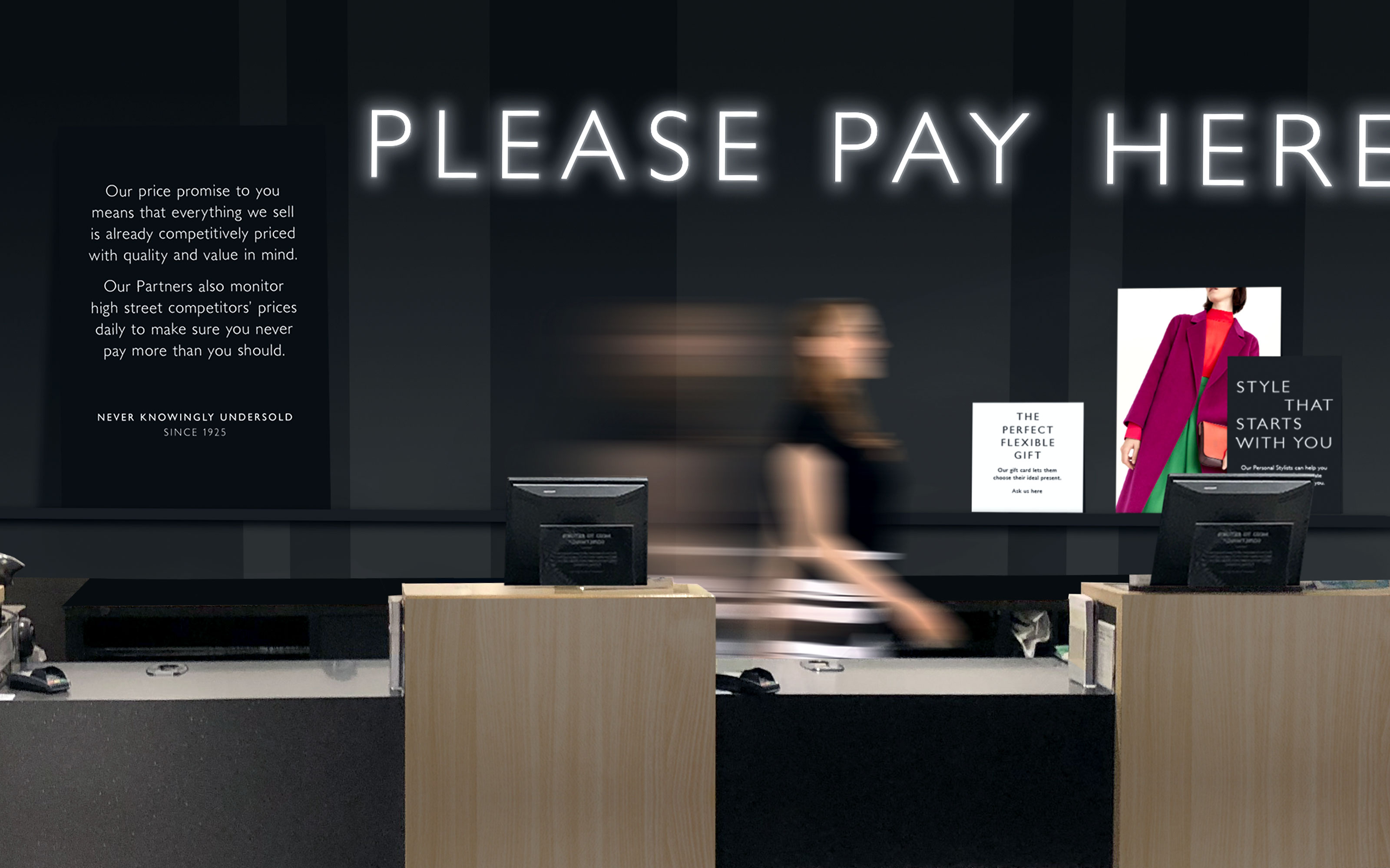 Till banks are a key brand moment
 Leaning panels promote after-sales services
A brand moment
Till banks were treated in a bold, easily identifiable, yet calm way. The subtle use of the brandlines pattern created the backdrop, against which leaning panels explain the onward journey to customers.These messages focus on points of brand differentiation, including delivery information and customer support. Bursts of colour and visual inspiration were introduced through the restrained use of photography, relevant to each department.
This project was completed at John Lewis & Partners.© John Lewis & Partners
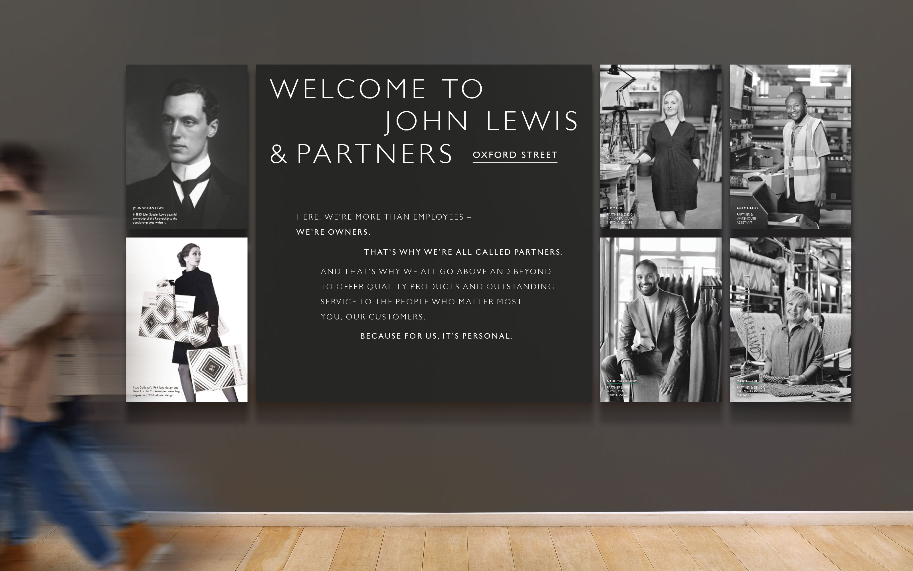 Welcome message with manifesto. Typesetting by Pentagram
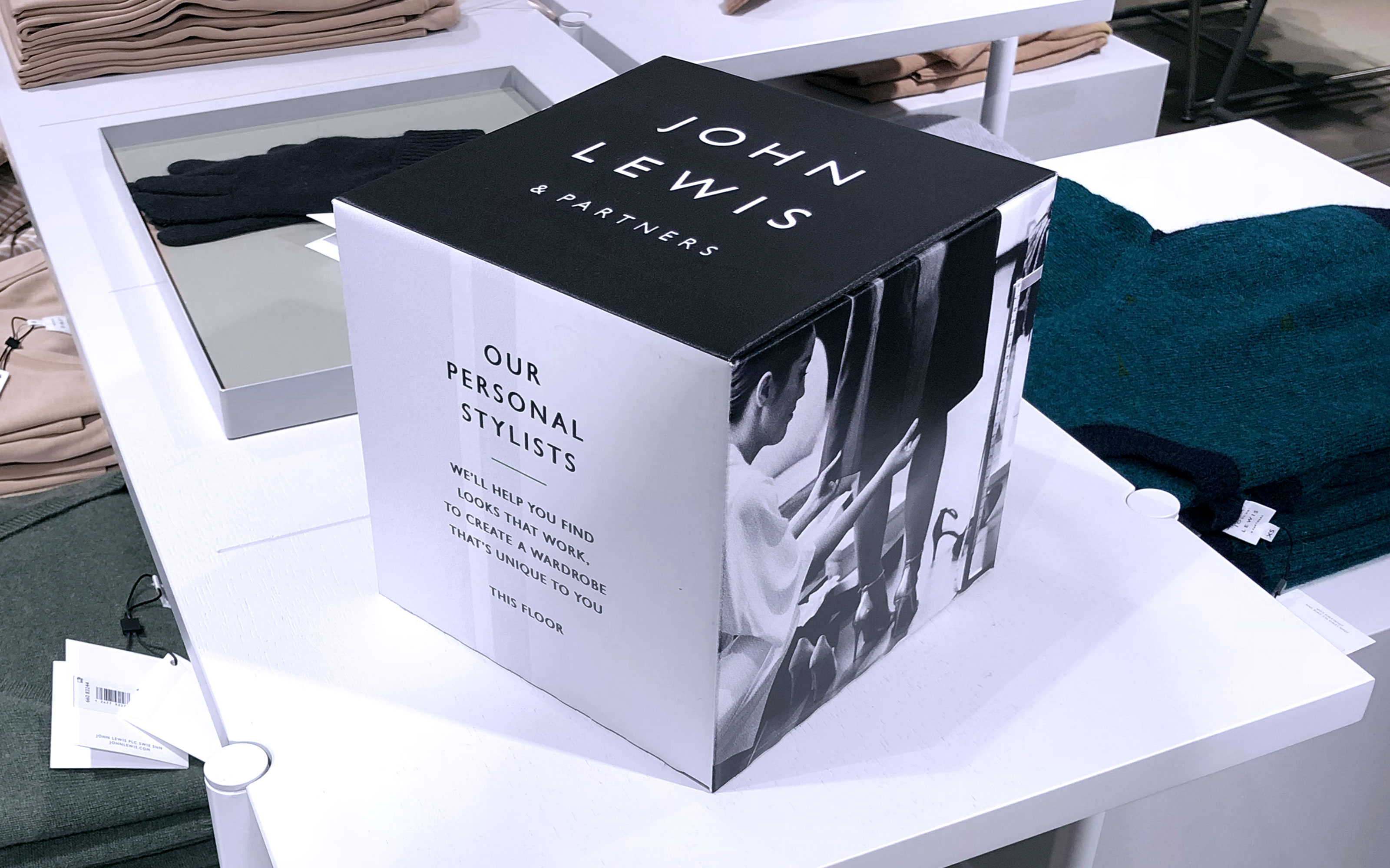 Highlighting services, incorporating photography of Partners in action